Since a gauntlet (where exactly can I buy one as I do need a new gauntlet) has been thrown down by @AMSTS (All My Sports Teams Suck--a Tweety sports account set in Berlin yet doesn't really deal with Hertha Berlin) and @Real_DJ_Swizzle (who apparently is at college studying to long snap shepherds) on Twitter to put my monkey where my logo is, here is my totally biased Top 10 Minor League Baseball Logos for 2016.
Just to give you a baseline that some of you can relate to, on the Major League level I'm talking anything from a Gothic D to the Swingin' A's. I'm also partial to cartoon birds and even racist co-opting of Louis Sockalexis' Tribe but no Sox of any kind and certainly no "team name + baseball" is anyone's idea of "cool" let alone worthy of any "best of" logo lists. In other words: If it's gaudy, I don't want to party. If it's easy on the eyes, Borat high fives.
So let's logo-a-go-go...minor league style.
10. Albuquerque Isotopes

Not a huge fan of the color scheme but Homer J. Simpson's Southwest cousin to the Springfield Isotopes is well balanced and gets an A...for should've turned left at this city.
These directions are really starting to bug me
9.

What can I say? I'm a sucker for black and yellow (black and yellow, black and yellow) from the Pittsburgh Pirates and the other Iron City Beer city's teams as well as bees ever since the days of Karl-Heinz Granitza and the Chicago Sting.

Still I wish the Bees went back to this Little Rascals-looking bee.

8. Carolina Mudcats

Mudcat Grant would be proud.
7.

Usually not a big fan of sticking a baseball as your logo, but love that the sun raises its eyebrow and winks when it's game time. Then again a huge fan of this guy with a baseball as his head so maybe as long as the baseball is "a head" of everything else, I'm good logo-wise with that.

"Nothing to see here. Move along, people."
6.

Animals swinging bats. Never a bad move. Plus this Bison knows the home run porch at Coca-Cola Field is in left.
5. Durham Bulls
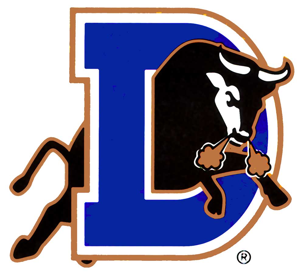
Need I say more?
A Nuke LaLoosh classic with no BS in this design.
4.

Yes, in 2016, the name should be changed but until that day this smallpox blanket meets Native American ninja throwing star gets the heave-ho, I'm all onboard. Although it does also remind me of a certain group of aliens.
One small vertical leap for the Moon-inites
3.

Maybe a tad boring for some but with MLB teams now going for the ring around the logo (with team name in that ring road), I dig one of the early adopters. Also, horses in silhouette just work.
Hi Ho, Mustangs . . . Away!
2.

So it's an apple with a cooking pot on its head? That's what you're going with? Hey, I have no idea what tin-cap sort of town Fort Wayne is or if Bruce Wayne or Wayne Gretzky now lives there. All I know is I would wear this on a T-shirt anyday.
1.

An oldie but still a goodie. How can you not love a confused lugnut just trying to fit into this wacky world of minor league baseball?
There you have it, folks, enjoy and check out the two guys' Twitter feeds at the top I mentioned for inspiring me to get off the bench and do this.
Enjoy the season.
Check out a minor league baseball game in 2016. Who knows?
You just might find a team and a logo you'll love.


No comments:
Post a Comment